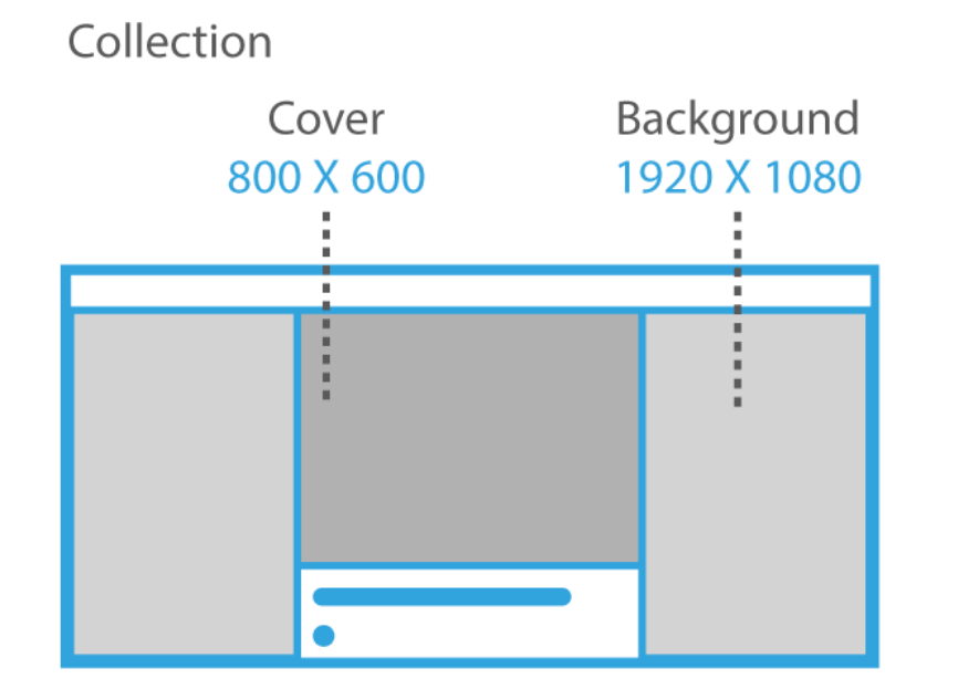
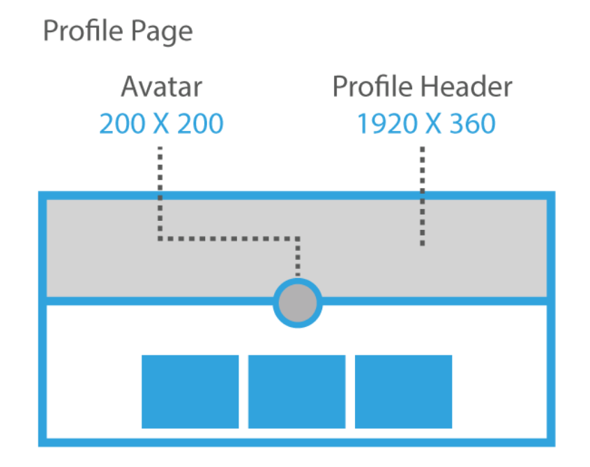
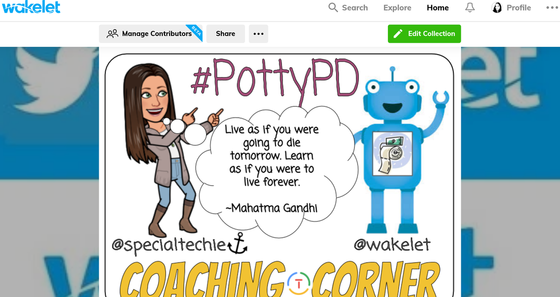
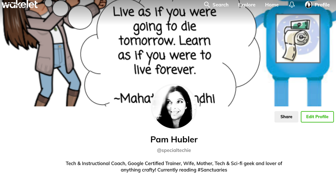
It's Easier Than You Think!So... I'm taking Tony Vincent's Classy Graphics class. It is actually the course that was held this Winter, but I'm just now getting to it. 😏 That's the beauty of his Google Classroom courses... they stay open! The assignments are way passed the due date, but I can still turn them in, get feedback, and see what others have turned in. Of course, it would be much more engaging if I did it when everyone else did, but I'm still learning from everyone in the class (even if they don't know it). I could try to explain the tips and tricks to creating these templates, but it's best to take the course and learn from the man himself! You can find out more about his courses here. Here's what I've created so far... Google Classroom HeaderAlthough Google Classroom header images don't show up as well as you would like them too (hopefully Google will change that soon), I suggest using bright colors with a light background so it will still show up once auto color happens. Some of the templates are colored already if you want to use them. If you want to change the colors, you may want to "ungroup" the shapes first by click the image, then "arrange", then "ungroup". Just be careful not to move them while they are ungrouped if you want to keep them aligned. When you are done, you can "select all", click "arrange", then "group" to move them around at one time. Once it looks the way you want, download the image as a PNG and save it. When you go to Google Classroom, you click "upload photo" and adjust it as necessary. The images below are what it would look like as a PNG and added to a Google Classroom.  As you can see, the image darkens quite a bit. My background is transparent here, so you could try making it white if you want it brighter. I like to use a "test class" for trying out new headers and the different features of Google Classroom. I also add my own children into the classes so I can log in as them to see what it looks like from the student side. Twitter Cover Photo TemplateI LOVE Twitter for connecting & sharing with other educators! Using a personalized header gives you a chance to show who you are quickly and the options are endless here! The best part about using Google Slides & Google Drawings to create headers is that you can add as much information as you want without worrying about formatting and spacing. I would suggest using this template to create as many as you want, then save each of them as a PNG. You may want to create a folder to keep the PNG files in one place so it's easy to access! Mine is simply called "Twitter Covers". Wakelet Header, Background & Cover TemplatesI use Wakelet A LOT, so I figured this would be a valuable use of time for me. The profile header and the cover images are probably the ones I personalize the most. The background is covered in the middle, so you only see the right and left side of the image, so the library images are usually fine to use. You don't even really need to use them, but I like having an added visual element to the back of my Wakelet Collections. Another thing to keep in mind is the different options for the cover image. You can choose between full cover, half cover, or hide cover. I usually choose half cover so it doesn't take up too much room at the top of my collections, but this example is a full cover. When you design your own, you may want the keep the top and bottom simple so it isn't cut off if you use the half cover option. If you don't use Wakelet (yet) and want to know more, check this collection out for resources to get you started. COLOR!This was my favorite section of the course! I won't give too many secrets away from Tony's course, but here are some of my favorite sites I used to find the perfect color choices. Careful... you can spend a lot of time on this. 😍
0 Comments
Your comment will be posted after it is approved.
Leave a Reply. |
AuthorI'm an Innovative Learning Coordinator in Berkeley County South Carolina and a Google Certified Trainer. Archives
April 2024
Short Cuts
All
|





 RSS Feed